
Welcome To Cosmotechnology
Featured products
-
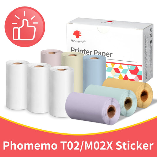
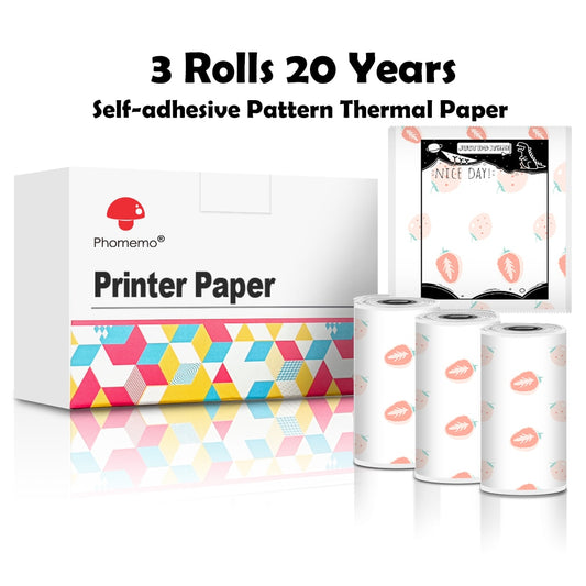
Phomemo 3 Rolls sticker paprer
Regular price From $11.00 USDRegular priceUnit price per$13.00 USDSale price From $11.00 USDSale -
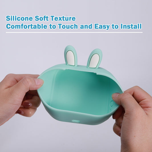
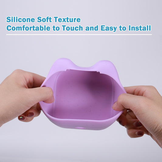
Phomemo silicone cover
Regular price $15.00 USDRegular priceUnit price per$20.00 USDSale price $15.00 USDSale -
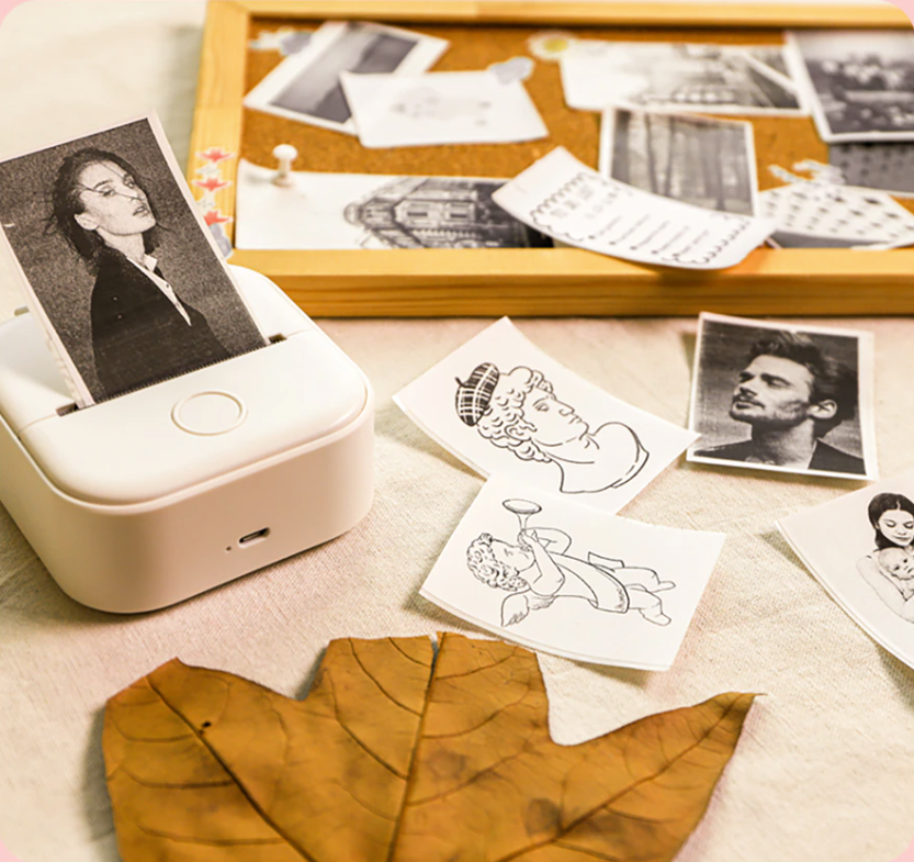
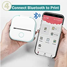
T02 Portable Thermal Printer
Regular price From $34.99 USDRegular priceUnit price per$69.99 USDSale price From $34.99 USDSale
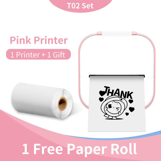
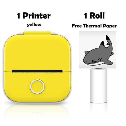
Never Run Out of Ink!
Wireless and Compact: Print on-the-go with ease. This pocket-sized printer connects to your mobile device effortlessly.
Ink-Free Printing: Say goodbye to costly ink cartridges. Our thermal technology ensures reliable, eco-friendly printing.
Endless Possibilities: From photos to to-do lists, print whatever you need instantly with the T02 portable thermal printer.
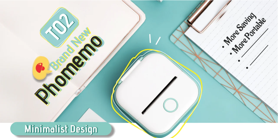
simple and compact
Discover the ultimate printing companion in the T02 Portable Thermal Printer. Embrace its elegant and minimalist design, perfectly engineered for convenience. This compact powerhouse fits snugly into your palm, making printing on-the-go a breeze. Say goodbye to bulky printers and experience the simplicity of T02.
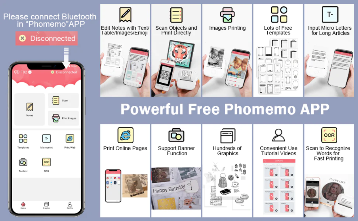
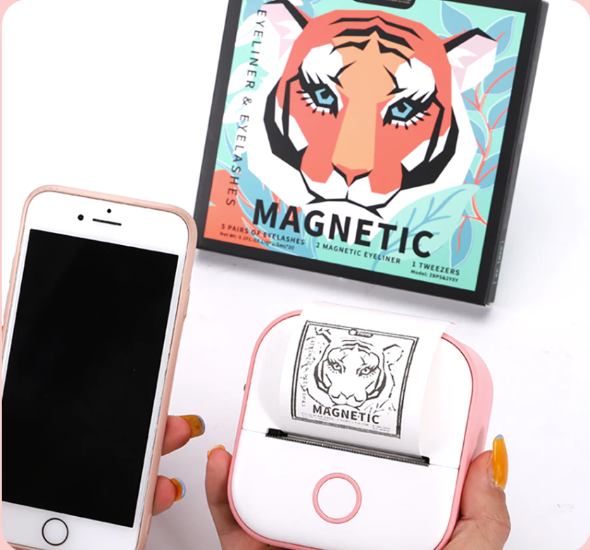
Multifunctional Thermal Printer and Free Phomemo App!
Elevate your printing experience with the T02 Multifunctional Thermal Printer. Seamlessly connect to the free Phomemo app and unlock a world of possibilities. From custom labels and vibrant stickers to artistic photos and detailed notes, let your creativity flow effortlessly. Embrace versatility and ease with T02 and the power of the Phomemo app – the perfect duo for every printing need.
The Ideal Gift for Every Occasion
Looking for the perfect gift that combines practicality and thoughtfulness? Look no further than the T02 Portable Thermal Printer. This versatile and ink-free printer opens up a world of creative possibilities for your loved ones. Whether it's custom labels for the organized ones, memorable photo prints for the sentimental souls, or personalized art and crafts for the creative spirits – the T02 offers a unique and thoughtful way to express your love and appreciation. Make every occasion extra special with the gift of endless printing potential with T02.


Let customers speak for us
Satisfied, I am on my second purchase, the parcel arrived 4 days before

The White open with blue printing is one of my favorites. Very good quality

The White open with blue printing is one of my favorites. Very good quality

Great labels. Identical to the ad. Very happy with the purchase.
Great labels. Identical to the ad. Very happy with the purchase.
works great. the regular adhesive prints real well from light to dark. the transparent paper is best at the dedicated option. I pictures I've included shows them from light to dark on regular paper and also in the medium and dedicated option for the transparent paper. The regular paper says its good for 2yrs, UT I hope it lasts a lifetime. The transparent one says it should last a lifetime.